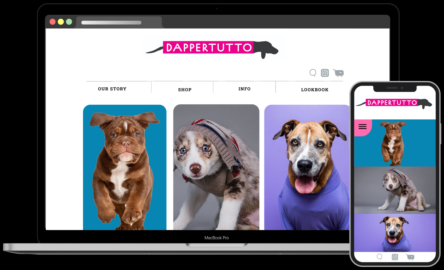
DAPPERTUTTO
FOCUS:
UX/UI Design, Branding
Team:
Solo project
Tools used:
Figma, Photoshop
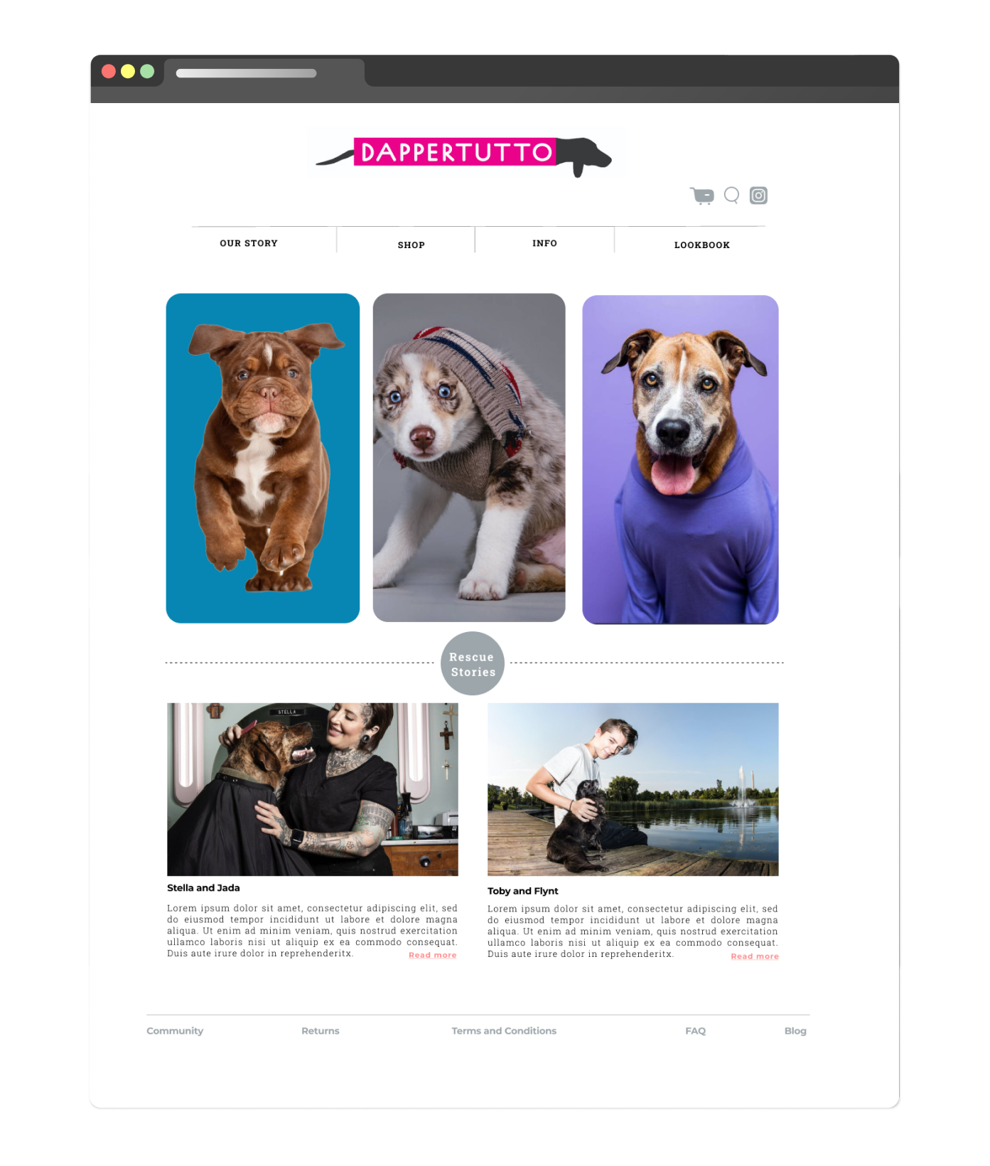
Dappertutto is an online dog clothing store. Not just any clothing store, it’s for people who refuse to go anywhere without their dogs: work, a bike ride, beach, camping, airplane, etc, etc. If the dog can’t come, we are not going. It has urban / high fashion vibe, and focuses on style for both dogs and their parents.
GOAL:
- Create an appealing site that attracts new customers, and has a friendly, yet sophisticated vibe
- Communicate that this business does not only sell clothing and accessories, but is heavily involved with communities, in charity work, supports animal shelters.
PROBLEM STATEMENT:
- Identifying the target audience, and what problems they would face as potential users. How can I identify a user for a business that doesn't exist?
- There is a number of other pet clothing stores. How is this one different? What does it offer that others don’t?


1
RESEARCH
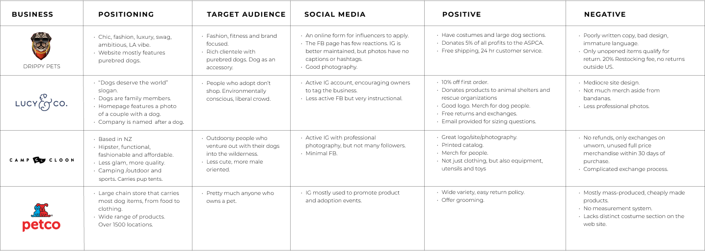
My first step was to find existing services that provide similar products. I spent some time researching various pet clothing store brands, from large chain stores to small boutiqies, figuring out what already exists on the market, and what is missing; who the target audience should be for this business.
COMPETITIVE ANALYSIS, 1:1 INTERVIEWS
USER RESEARCH
I found 5 different dog owners from various backgrounds and locations, and conducted 30 minute 1:1 interviews to gain some insight on why people shop for dog clothing, what they are happy with, and what is missing: a 45 y.o. publishing CEO from Brooklyn, a poet from Califoronia, a nurse from Brooklyn, a photographer from UK, and a sociology professor from PA.
Key Insights:
Based on my conversations, I uncovered the below:
- Wanting products that would allow owners to take their dogs with them wherever they go is a common theme.
- Dog owners prefer shopping at small businesses instead of supporting Amazon, Walmart, or other large chains.
- But a website that is complicated to navigate will turn them to a larger store.
- Dog owners really love products like water bottles and bowls, that makes it easier to spend time away from home with their dogs easier.
- Clear measuring instructions are important, as one often can’t return dog products.
- Dog owners want products that would allow them to travel with their dogs easier.
One person said:
“If the dog can’t come, we are not going.”
I decided this would be the main angle for this business, and people who feel that way will be the target audience.
2
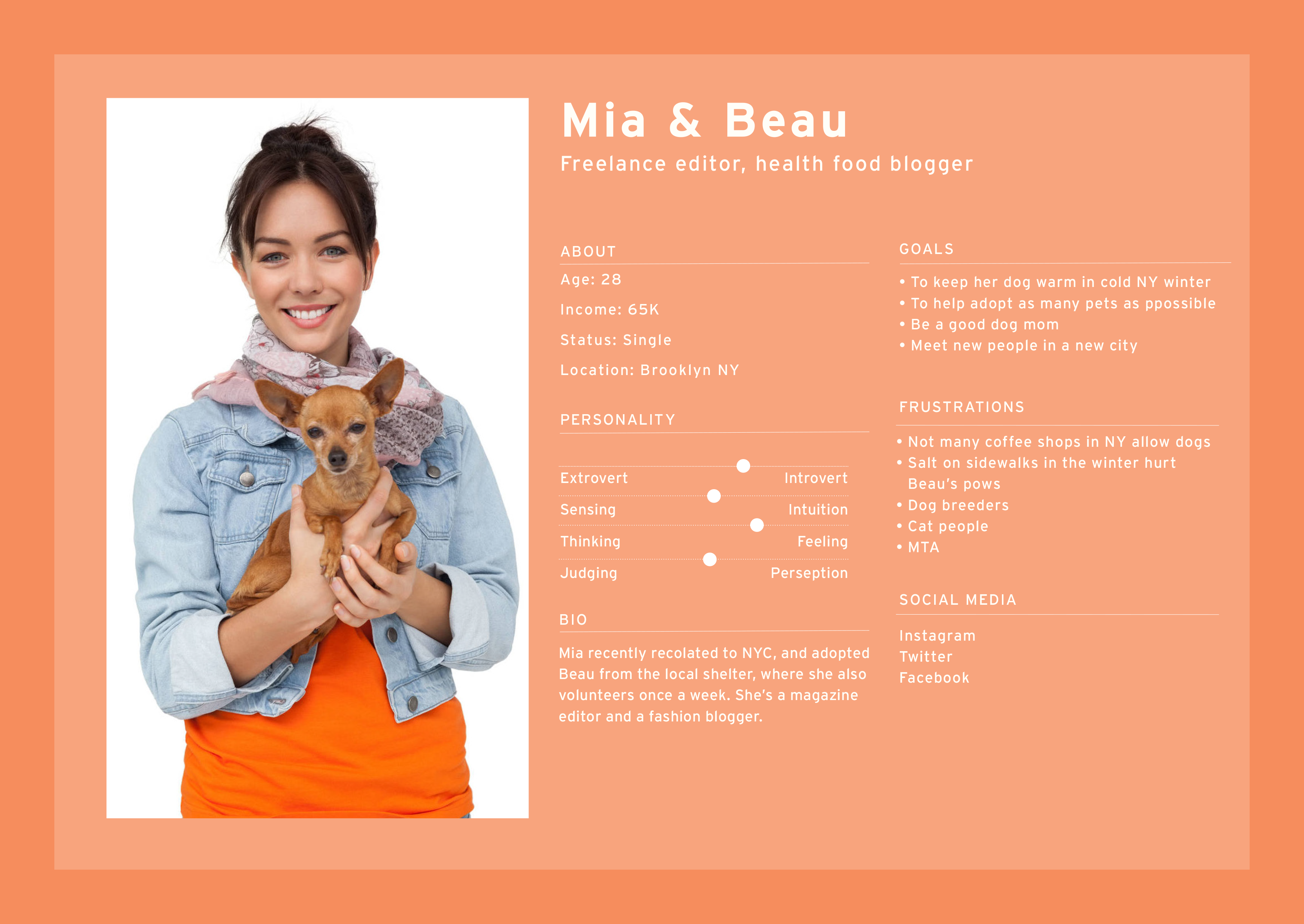
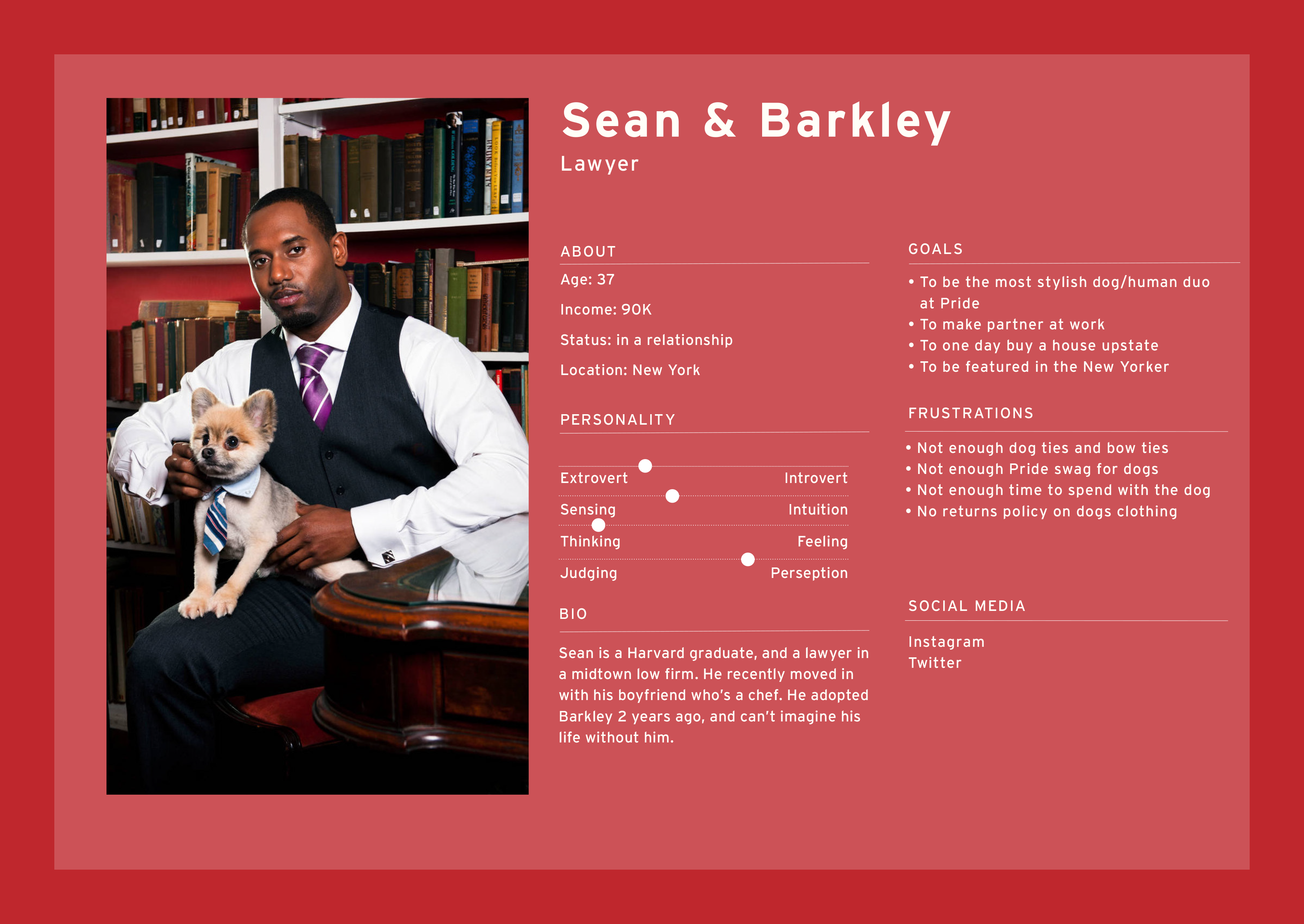
IDEATION
PERSONA DEVELOPMENT, USER JOURNEY, SITE MAP, WIREFRAMING, AND PURCHASE FLOW
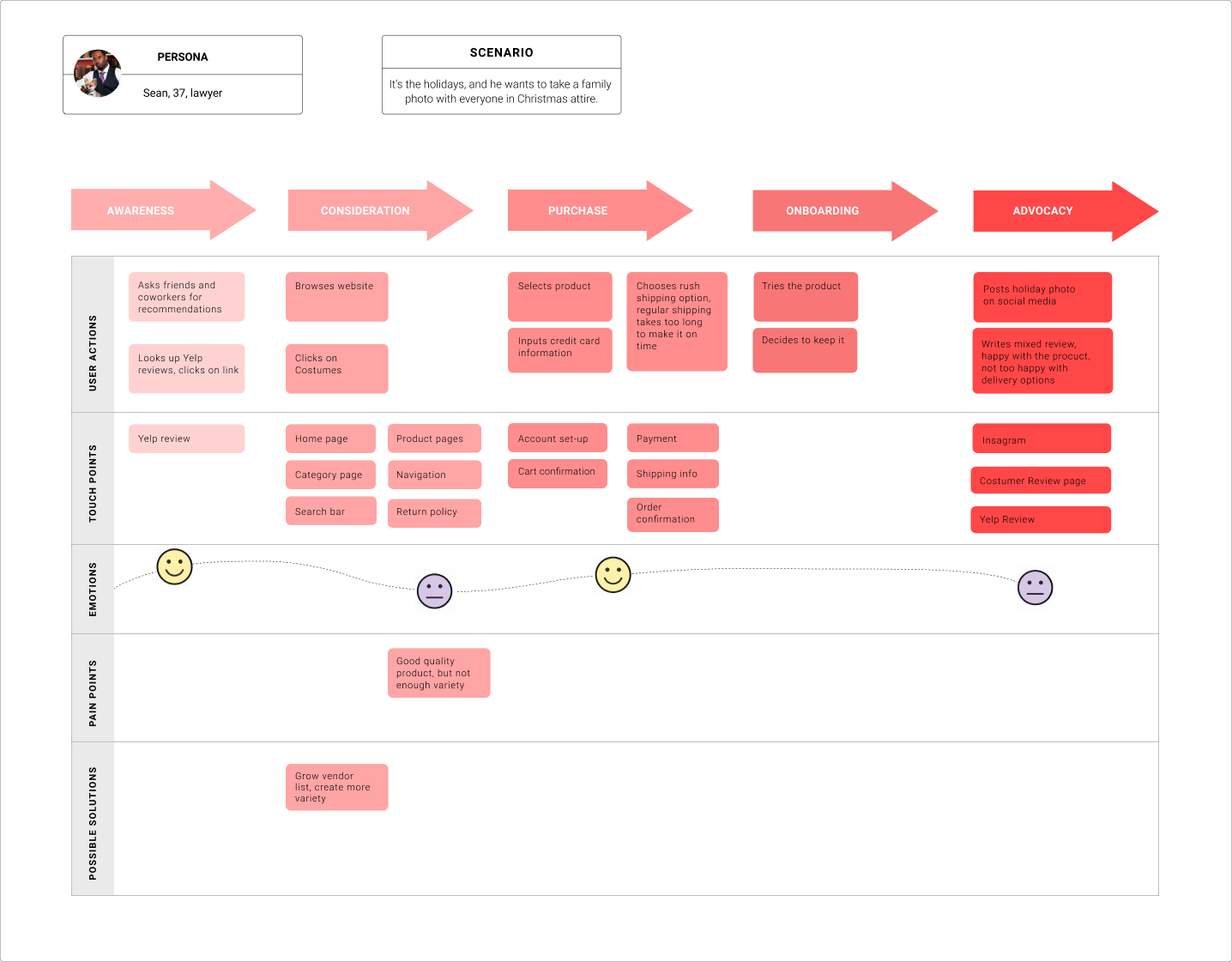
Two personas were created based on uswer research. This would help me put a face to who I was designing for and their core needs and frustrations.
USER JOURNEY
User journey was created to begin thinking about how my users would interact with the product.
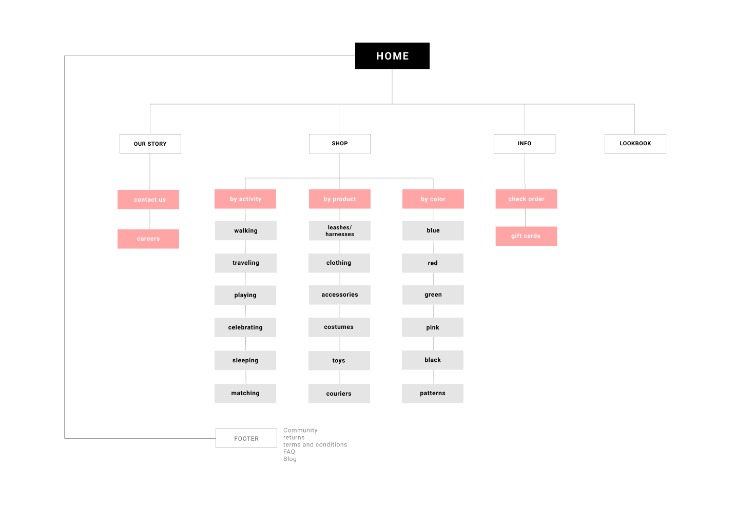
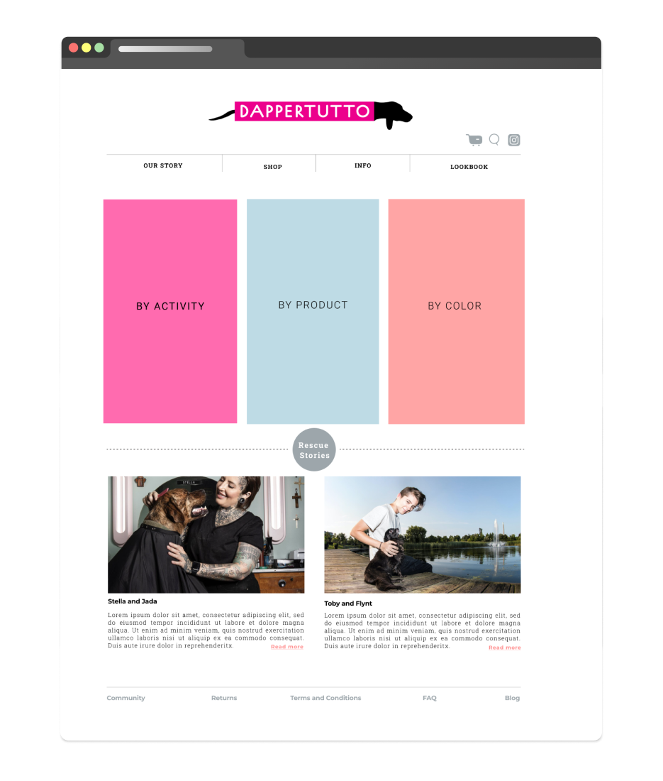
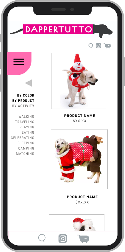
SITE MAP
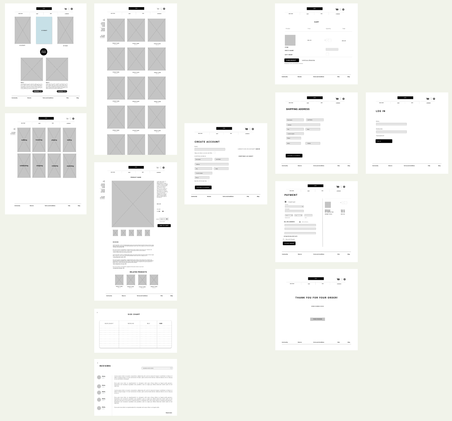
WIREFRAMES
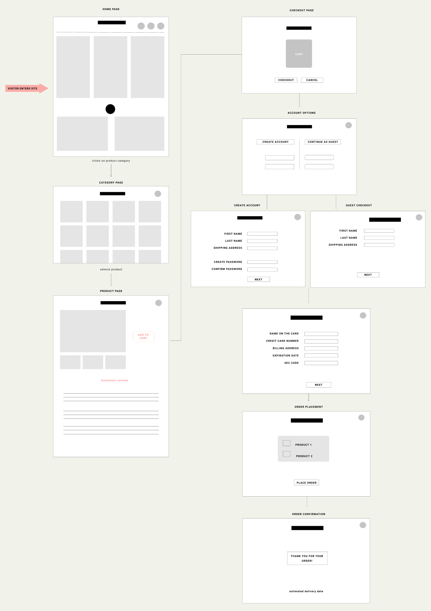
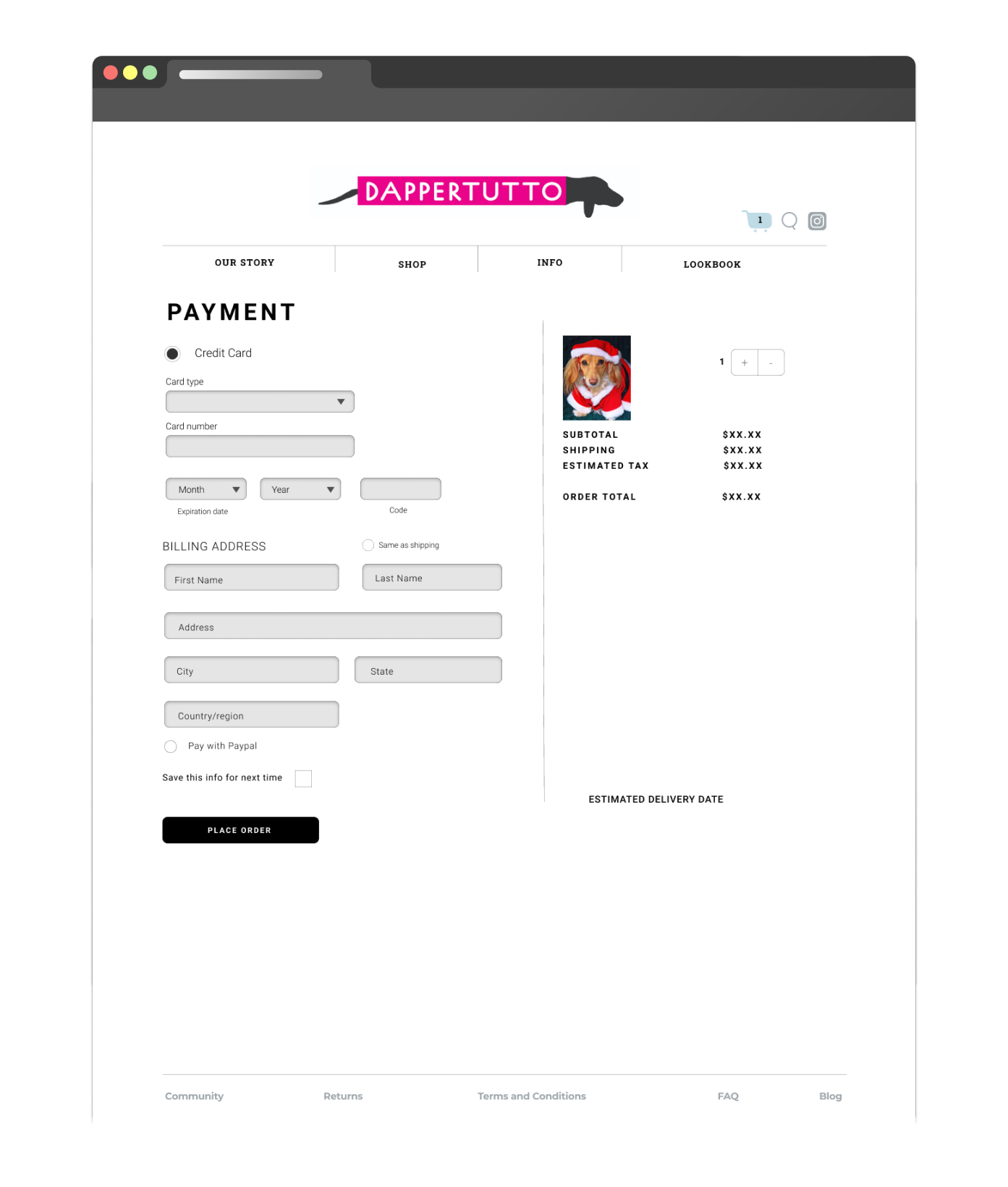
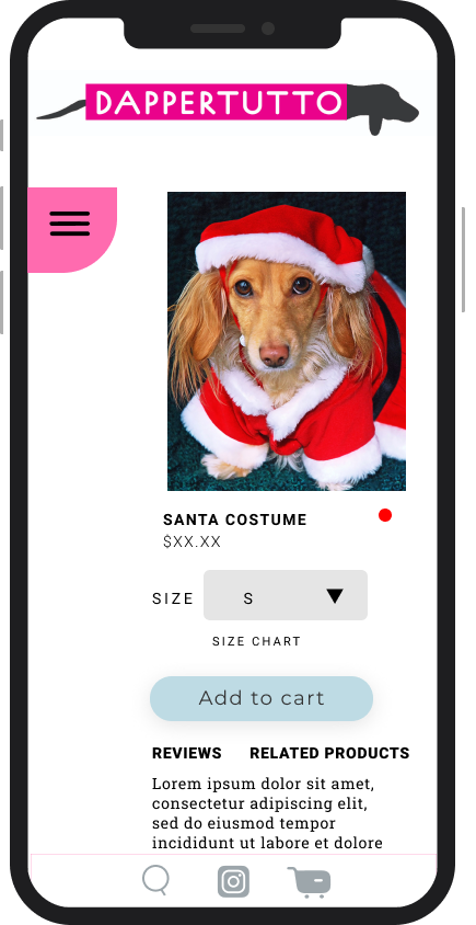
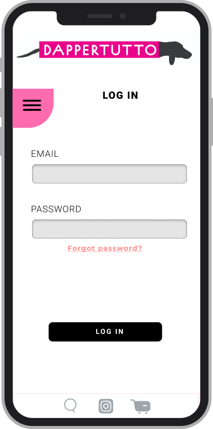
PURCHASE FLOW
BRANDING
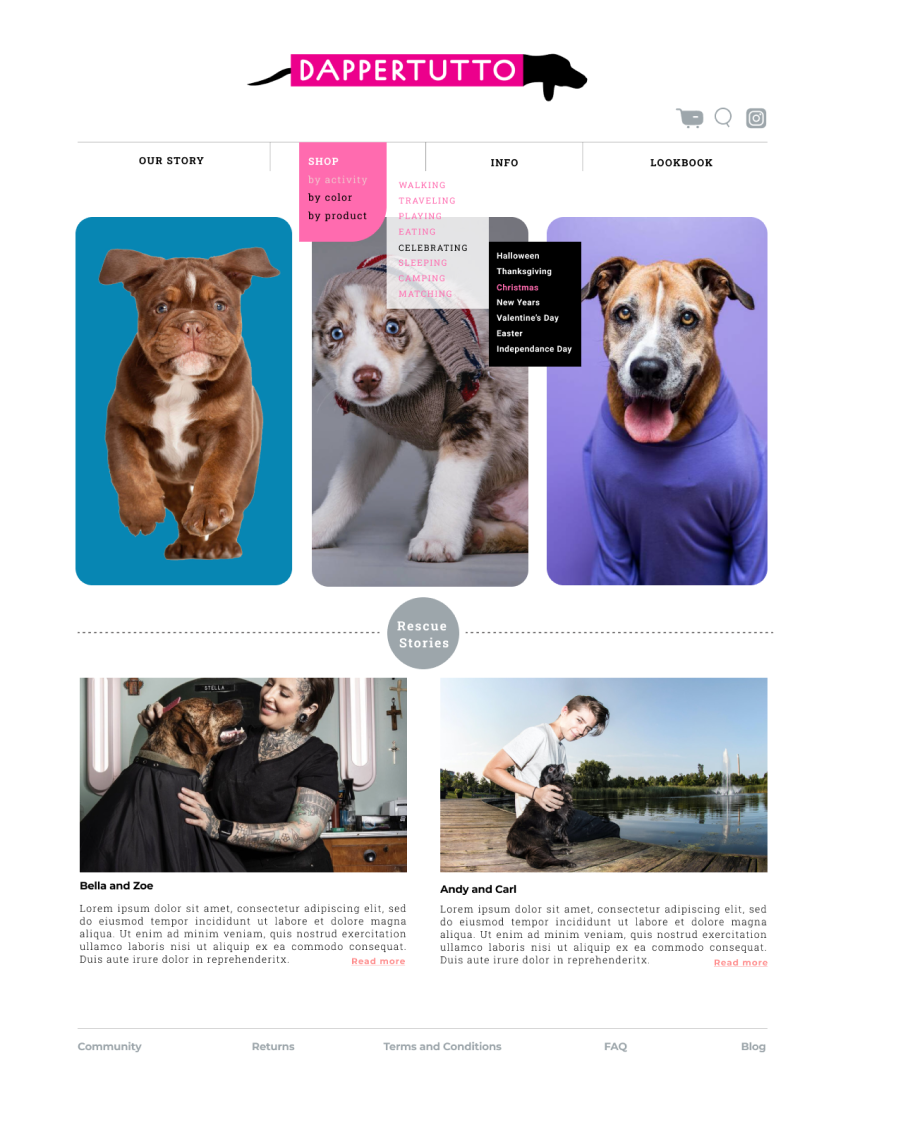
I created a logo and that reflects high end quality and a fun, quorky nature of the brand, and followed with UI guidelines.
LOGO
This logo is a universal signature we use across all our communications. We want it to be instantly recognizable, so consistency is important—please don’t edit, change, distort, recolor, or reconfigure it.
TYPOGRAPHY
ROBOTO SLAB
WEIGHTS:
Bold
Medium
Regular
Light
Thin
H2 Heading
H3 Heading
H4 Heading
H5 Heading
Montserrat
WEIGHTS:
Extrabold
Bold
Semibold
Medium
Regular
Light
Extralight
H2 Heading
H3 Heading
H4 Heading
H5 Heading
H6 Heading
Lorem ipsum dolor sit amet, consectetur adipiscing elit, sed do eiusmod tempor incididunt ut labore et dolore magna aliqua. Ut enim ad minim veniam, quis nostrud exercitation ullamco laboris nisi ut aliquip ex ea commodo consequat. Duis aute irure dolor in reprehenderit in voluptate velit esse cillum dolore eu fugiat nulla pariatur. Excepteur sint occaecat cupidatat non proident, sunt in culpa qui officia deserunt mollit anim id est laborum."
Lorem ipsum dolor sit amet, consectetur adipiscing elit, sed do eiusmod tempor incididunt ut labore et dolore magna aliqua. Ut enim ad minim veniam, quis nostrud exercitation ullamco laboris nisi ut aliquip ex ea commodo consequat. Duis aute irure dolor in reprehenderit in voluptate velit esse cillum dolore eu fugiat nulla pariatur. Excepteur sint occaecat cupidatat non proident, sunt in culpa qui officia deserunt mollit anim id est laborum."
Lorem ipsum dolor sit amet, consectetur adipiscing elit, sed do eiusmod tempor incididunt ut labore et dolore magna aliqua. Ut enim ad minim veniam, quis nostrud exercitation ullamco laboris nisi ut aliquip ex ea commodo consequat. Duis aute irure dolor in reprehenderit in voluptate velit esse cillum dolore eu fugiat nulla pariatur. Excepteur sint occaecat cupidatat non proident, sunt in culpa qui officia deserunt mollit anim id est laborum."
COLOR PALETTE


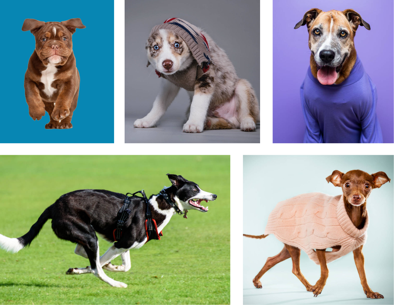
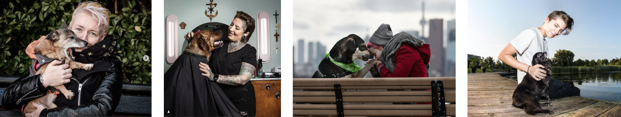
PHOTOGRAPHY
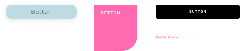
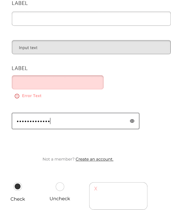
GUI ELEMENTS

3
PROTOTYPE AND USABILITY TEST
After building the high fidelity mock-ups using the UI kit and style guide, a prototype was developed in Figma for conducting a usability test for the given user flows. Usability tests were facilitated with five participants using Figma Prototype.
GOALS
1) Test if the user can use check-out flow easily and intuitively
2) See if the way categories are organized works well for finding and buying a product
3) Test how the user feels about overall look and feel of the site
4) Identify any other potential issues
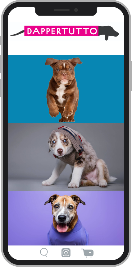
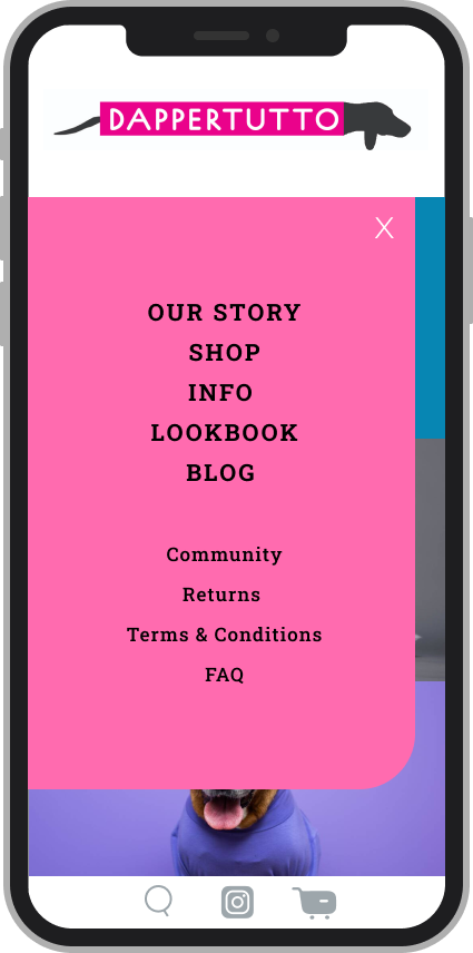
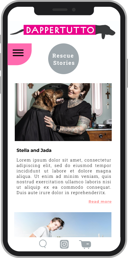
Desktop
Mobile
TESTING TAKEAWAYS
- All participants found the check out experience flows well
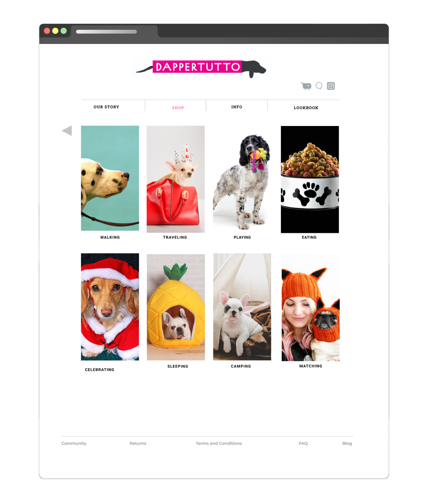
- 2 participants found the Category system confusing: the main menu in the header is where they’d first look to find a product, and ideally it would show all of the sub-categories under each of them, so they’d get to the product without too much clicking. They also first percieved the 3 main photos on the homepage as random promotional images, not an entry point.
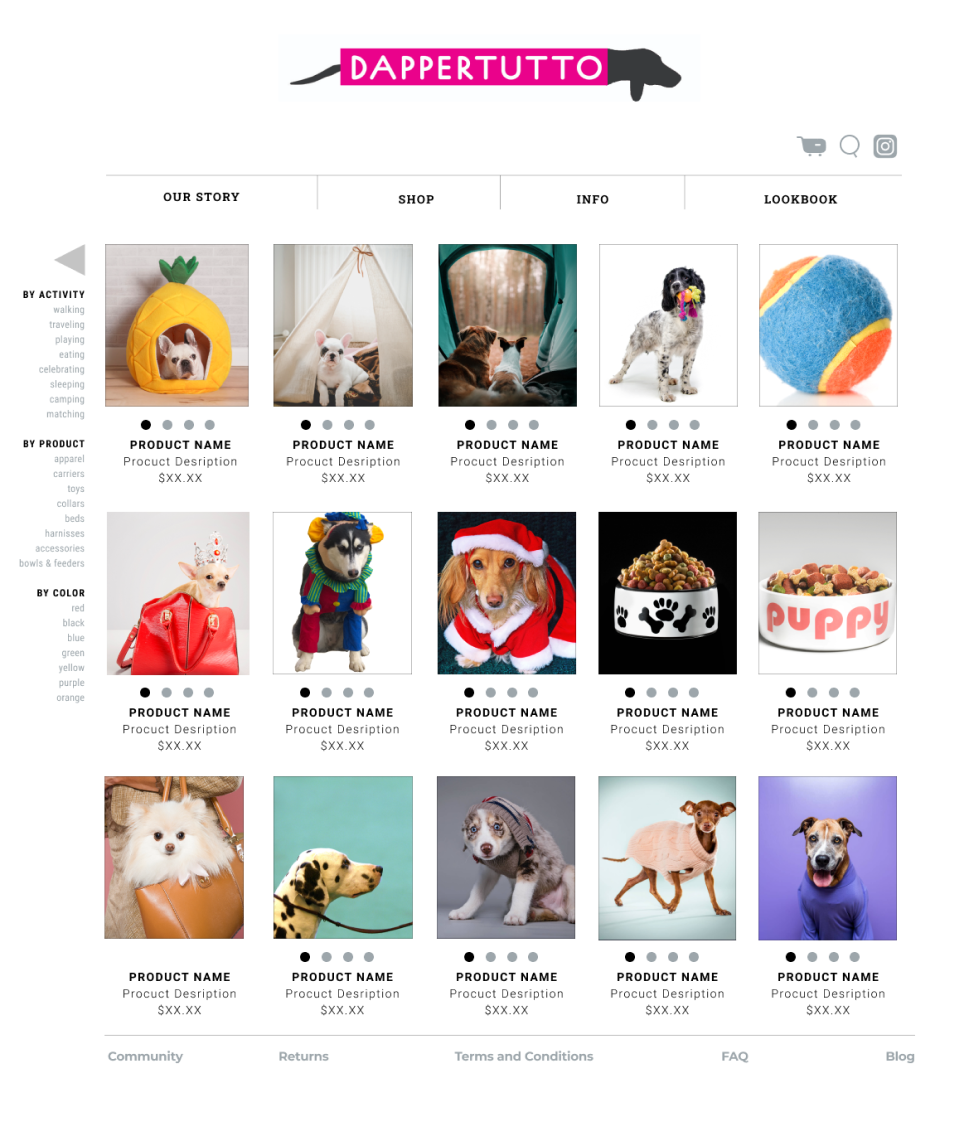
- One participant expressed the desire to have a page with all available products, regardless of categories
- 2 participants felt like there should be more text about what the company is, what the company is selling, and why there is a rescue dog element.
- All participants liked the logo/fonts/colors. 3 participants expressed the desire for the dog in the logo to have little legs
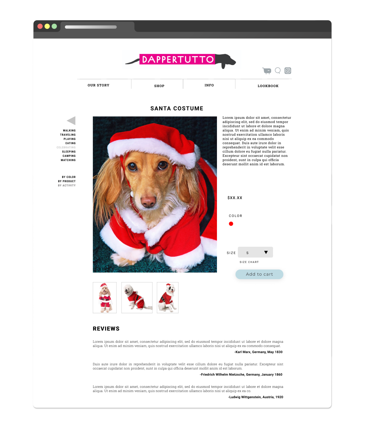
- 1 felt like there should be more descriptive text on each product
- 1 found the dropdown menus annoying, and the gray input fields dated
REITERATIONS
Using the information I gathered from the usability test, I realized that the category system is confusing to the user, and making it more intuitive is the main priority. I added an additional purchase flow with a main menu as starting point, added Shop All page, and added description to each product.
LEARNINGS AND TAKEAWAYS
- Understanding a user group and a target audience for a product that does not exist yet can be a challenge.
- Creating a navigation system that’s different from what’s commonly used is exciting and interesting, but users will automatically go to what they are used to, so it might not be worth the effort.
- Because of the nature of a prototype, it’s not always possible to determine if the flow works well, it might be necessary to create a few other alternative flows for the next round to give the user a number of different options.
- Confirming assumptions through inquires and interviews gave me the insights to design the features that are intuitive to the user and function in a way that is familiar and recognizable to them.
NEXT OBJECTIVES
The next step is rolling out a framework for designing screens and flows for the Blog section, Our Story, and Searching.
For the upcoming project I will need to:
- Test out the new purchase flow that I added to the menu
- Create prototype for mobile, and conduct user test for it
- Rethink some visuals, like forms, drop-down menus, and the logo